
What is web accessibility? It is a set of principles and settings that are put in place on a site to allow people with disabilities to access it, regardless of their condition. The web is an ever-changing resource and access to information should be fair for all users.
Many websites neglect accessibility and this can greatly influence the experience of people who have difficulty viewing content. It may be appropriate to discuss it in person with the agency developing your site for recommendations. If it is targeting an older and less skilled audience on the web, it is relevant to put in place accessibility strategies that will greatly improve their experience. Otherwise, some users may not return to your page.
Web accessibility standards are governed by the W3C (World Wide Web Consortium) and there are several levels of complexity to make a site accessible. In this article, we'll start with the five things to know about web accessibility.
1. Measure the Experience with Google
In November 2020, Google announced that the ranking of web pages would be affected by "on-page experience" in its search engine. This update will be phased in from mid-June through August. This puts a lot of emphasis on good practices such as the performance of web pages and the quality of their content. A site with lower results in these criteria will be given a lower score than other sites with similar content. Meaning, there is a good chance that it will not be found in the first indexing of Google pages.
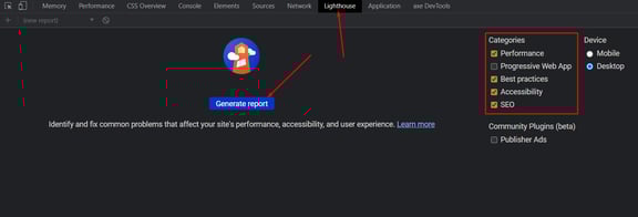
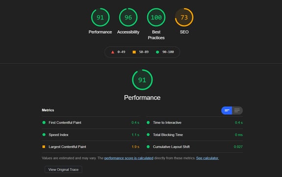
Therefore, it is very important to keep an eye on these criteria. An effective way to see if your site needs adjustments is to open Chrome for example, the development inspector (Windows: CTRL + SHIFT + J and MAC: CTRL + OPTION + J) then run a "Lighthouse" scan. You will get an overview of the elements that can reduce or increase the score of your site.
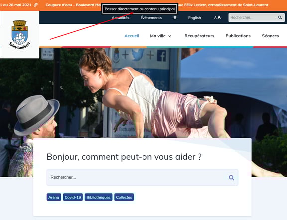
2. Offer a Way to Jump Directly to the Main Content
It is strongly recommended to have a module allowing you to jump directly to different content. Thus, the "Bypass Blocks'' criterion is an asset on your site. Normally, during the integration, we add a hidden block just at the top of the navigation which becomes visible when we navigate with the TAB button on the keyboard. This block contains links allowing the user to go directly to the main content of the site, without going through the navigation. Hence, a user who visits your site with an e-reader will not have to cross all the navigation links with the TAB button on the keyboard to consult the main content immediately.
Example of web accessibility optimization
When a user presses the TAB button, a hidden menu appears at the top and allows them to jump straight to the main content, bypassing the navigation.
 3. Choose the Right Terms and Wording
Going back to the introduction, the highlight of accessibility is "fair for all". This is why a user with a visual impairment who uses an eReader to help understand the content of the site must have the same experience as others.
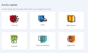
Often, some sites fail to label sections with titles and short descriptions of what the information block will contain. For example, a section with 6 blocks framed with a short text suggests that these blocks will be clickable to a source of information.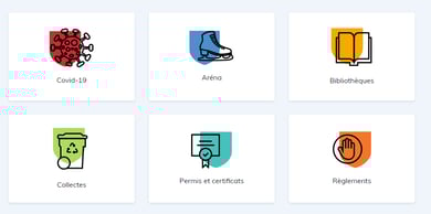 However, for users with a disability, their eReader will fall directly on the first "COVID-19" link without explaining to them the purpose of this content. To remedy this situation, it is very important to always have a section title and a short description so that the user has a premise of the content they are about to consult.
4. Describe the Images Well
A user with a visual impairment or blindness should be able to interpret the images that a web page contains. Many sites often lack the "alt" attribute on image tags. This attribute is used to describe the content of the image if it does not load on the page. The attribute is also interpreted by an ereader or any other equivalent software. Depending on the complexity of the image, it is still necessary to insert a fairly precise description for users with disabilities.
If the image is purely decorative such as the background of a banner with text over it, the "alt" attribute should still be present but empty to instruct assistive technologies to ignore it.
In an ideal world, content images are embedded in an img tag and decorative backgrounds are inserted in the CSS background-image property, which is ignored as an empty "alt".
Examples of web accessibility optimization
Here are two examples for the alt content of our image: Incorrect: cat
Correct (in the best of all worlds): A long-haired ginger cat scratching its head with its left front paw in front of a white-gray wall.
Should the description always be so precise? In the best of all worlds, yes. It's always better to have a complete descriptive sentence with a subject, verb and complement in the "alt" than to have nothing at all for content images.
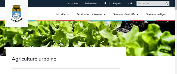 Here is an example of a decorative image. This is a background-image and does not need to be described by an alt attribute since it is quite abstract and is only there as an atmosphere for the page. There would be no added value in listing a description such as: Several lettuce plants in the ground.
5. Pay Attention to the Readability of Texts
Even if there are no mandatory standards for the texts of a website, in general, it is better to favor a basic typographic size of 16 pixels. Each website has its own typographical rules for content text and section headings. It is the responsibility of the entire production team to anticipate what the issues will be at this level for a potential client.
For example, one could afford to use a funkier font for a video game website whose target audience is 18-25 year olds since the age bracket is specific.
However, for a government site where the entire population is expected to consult it, it may be necessary to choose a more recognized font such as Tahoma, Calibri, Helvetica, Arial, Verdana, and Times New Roman. In this case, it will be necessary to be certain that the size of the typography is adequate for all the people consulting the site. Even if the user can "zoom" in the page, it is interesting to be able to provide them with a module that allows them to magnify all the text of the site.
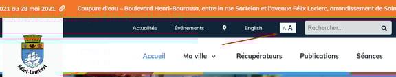
For example, the user can click on the following letters to magnify the typography from 16 pixels to 18 pixels.
It is at the discretion of the development team to choose the increased font size. It is important that the fact of enlarging the texts does not alter or break the layout of the contents of the site.
The web accessibility task
In conclusion, web accessibility is a huge project in itself when producing a website. Several factors must be taken into consideration before embarking on this project such as the budget, the schedule, the target audience, etc. It is the responsibility of the production team to properly inform the customer and to offer them the best solutions to meet their needs.
To learn more about accessibility, the official resource is the WAI (Web Accessibility Initiative) site available in several languages. There is also The A11Y Project website which is a community project to make accessibility easier to implement.
.png?width=1379&name=Aspect%20(1).png)


%20(3)-1.png?width=1080&name=Untitled%20(1920%20x%201080%20px)%20(3)-1.png)